Branding — Isle of Wight, UK
Baywatch
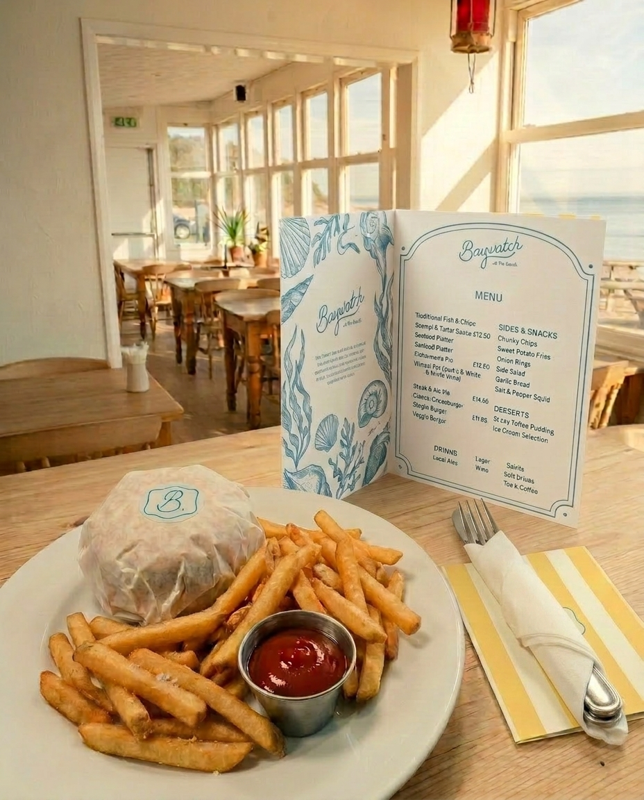
Baywatch on the Beach sits at the edge of the Solent, where the water comes right up to the window and the boats drift past Bembridge Harbour at their own pace. It's been a fixture on the Duver for years — a place locals come back to, and visitors remember. The brief was to give it a visual identity that matches the experience: warm, unhurried, a little proud of itself.
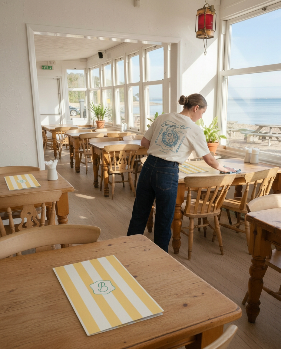
The refresh draws from the language of classic British seaside dining: broad awning stripes in warm yellow and white, a crested emblem that nods to old supper clubs and harbour towns, and a palette that holds up in full sun without shouting. The result is a brand that feels like it has always been there — because in all the ways that matter, it has.

Baywatch — Isle of Wight
The palette — butter yellow, warm white, deep teal. Colours pulled straight from the Solent on a good day. Nothing that shouts; everything that stays.
Colour that feels like the coast on a clear afternoon.
Brand Identity